VK

Redesigning Ontariocolleges.ca
A Challenging but Impactful Journey
Context:
OntarioColleges.ca is the primary application platform for Ontario’s public colleges. I initially proposed the idea to redesign the site after noticing persistent issues with usability, information architecture, and accessibility that were impacting users.
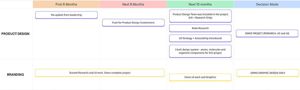
After I pitched the redesign, there was silence for about six months. Later, I discovered that work on the redesign had already started - led solely by the internal branding team, without involving the product design team.
Once I realized this, I pushed consistently for the product design team to be included. Eventually, we were brought in, but only with responsibilities for UX and research, while branding retained UI design. This fragmented structure led to misalignment, overlapping roles, and delays.
Complicating things further, the branding team’s initial research had major flaws - 50% of the personas used were not representative of actual users (e.g., including parents instead of students). Despite these challenges, I led the UX strategy and eventually helped shift the entire direction of the project.
Summary:
The OntarioColleges.ca redesign had a lasting impact on how product design is viewed within the organization. Although product design was brought in late and initially limited to UX and research, I used that opportunity to introduce accessibility standards (WCAG 2.1 AA), restructure the information architecture, and drive user-centered decision-making.
Once the research phase was complete, we moved on to wireframing, while the branding team simultaneously began developing the UI. However, after the branding team shared a few initial screens, both the product and leadership teams began to sense that the visual direction was misaligned.
The turning point came when I conducted A/B testing with college partners to compare a critical screen I designed with the version built by the branding team. The feedback was clear - my version was preferred for its usability, clarity, and overall experience. This evidence won over stakeholders and allowed us to fully take over the redesign, leading to a more accessible, user-friendly platform. The outcome helped reset internal expectations around ownership of UX and UI. More importantly, it created a shift toward user-centered practices across future projects.
What I learned was invaluable: how to lead through influence rather than authority, how to build trust with evidence, and how to persist through resistance. It reinforced that good design isn't just what we build - it’s also about how we advocate, collaborate, and adapt.
Note: My critique is not aimed at individuals, but at the process and approach that led to poor design outcomes.
My Role:
-
Senior Product Designer
Focus:
-
UX strategy
-
Design System
-
Research
-
Accessibility
-
A/B testing
-
Stakeholder management
Core Team:
-
Myself
-
Product Design Team
-
Branding Team
-
Developers
-
Product Manager
Sector:
-
Business to Customer (B2C)
Duration:
2 Years
Key Challenges:
-
6-month exclusion of product design from planning and research.
-
Branding-led research had 50% of personas misaligned with our core users.
-
UI ownership stayed with branding despite being a product design responsibility.
-
Organizational silos and lack of clear roles.
-
Resistance to feedback, with statements like “This is how we design things here.”

IMPACT
User Experience Improvements:
Research and UX enhancements led to a better navigation experience and improved usability, as validated by early user feedback.
Positive User Feedback:
Usability testing sessions and user interviews indicated higher satisfaction with the improved experience.
Process Improvement:
Product design regained UI control after a year-long branding monopoly. Internal trust in product design improved significantly. Led to discussions about redefining design roles within the organization to avoid similar conflicts in future projects.
Accessibility Compliance:
Achieved WCAG 2.1 AA compliance through UX recommendations.
Project Timeline
After I took the initiative to redesign, the below timeline highlights the behind-the-scenes journey of advocating for product design involvement. It focuses less on delivery milestones and more on the strategic efforts to shift ownership from branding to a user-centered design approach.
Challenges and Roadblocks
1. Identifying UX and UI Issues
-
I took the initiative to review the existing website and identified several usability and visual design issues.
-
Shared my findings with my manager and the product manager.

2. Lack of Communication and Involvement

-
After initial discussions, there was a six-month silence, during which I worked on other projects.
-
Later, I discovered that the branding team had started the redesign without informing the product team, even the product manager.
-
The branding team historically designed websites before product designers were hired, often with poor UI/UX results.
3. Advocating for Product Design Involvement
-
Discussed with the product team and my manager about involving product design but received no support.
-
Conducted a session explaining the importance of UI/UX in website redesigns.
-
Took almost 8 months to convince stakeholders to include product design in the project.

Taking Charge as Design Lead
4. Gathering data
-
Once included, I led the design efforts, focusing on gathering research data, customer support feedback, and user pain points.
-
On reviewing branding’s research, I found that 4 out of 7 user personas were incorrect, requiring a complete redo of user research.
-
Key insights were based on inaccurate data, leading to poor initial direction


5. Conducting Proper UX Research
I lead:
-
User research and interviews
-
User flows and How Might We (HMW) exercises
-
Competitive analysis and card sorting
5.1. Persona Comparison: Branding vs. Product Design
BRANDING -
-
During the first phase, the internal branding team conducted their own research without involving the product design team. Their personas included:
-
Adult Learner (Age 40–55)
-
Career-changer or lifelong learner
-
Rarely used the OntarioColleges.ca platform
-
-
College Partners or Guidance Councellors
-
Guide students on how to apply for a program
-
-
Parents
-
Researching on behalf of their children
-
Indirect users of the platform
-
-
-
Issue: These personas represented over 50% of non-primary users and were not the actual decision-makers or frequent users of the application platform. Mindset is we know our users so no need to talk to them. Most of the data was gathered from Contact Center.
PRODUCT DESIGN -
-
Once the product design team got involved, we revisited the user research and identified the core user base more accurately:
-
Grade 11/12 Students (Age 16–19)
-
High school students actively exploring postsecondary options
-
Needed clear guidance, user-friendly UI, and accessibility
-
-
Recent Graduates (Age 19–24)
-
Those seeking diploma programs or career redirection
-
More independent and task-focused
-
Expect intuitive, streamlined application flows
-
-
International Students
-
Actively exploring Ontario colleges online but ontariocolleges website is only designed for Canadians
-
Need guidance on how to apply
-
-
Guidance Counsellors and Parents
-
-
Outcome: The refined personas helped drive a UX strategy focused on clarity, usability, accessibility, and trust, making the platform more effective for its true users.
5.2. User Interview Results (Summary)
Goal of the Interviews -
To understand user pain points, expectations, and behavior while navigating the OntarioColleges.ca platform, with a focus on the application process, usability, and clarity of information.
-
10 users interviewed
-
4 High school students (Grades 11–12)
-
2 Recent college applicants (Ages 19–24)
-
2 International students
-
2 Parents (supporting applicants)
-
Some of the Key Findings -
-
Users reported feeling overwhelmed by dense content and lack of visual hierarchy.
-
Mobile users struggled with layout, zooming, and readability.
-
Button sizes and spacing weren’t optimized for touch.
-
Users found terms like “offer acceptance,” “program availability,” and “transcripts” confusing without context.
-
Outdated visuals reduced trust, especially for users unfamiliar with the platform.
Opportunities Identified -
-
Simplify and streamline navigation
-
Introduce progress indicators and onboarding
-
Redesign for mobile-first experiences
-
Define terms with tooltips or inline help
-
Improve error states and guidance
-
Modernize visuals for credibility and clarity
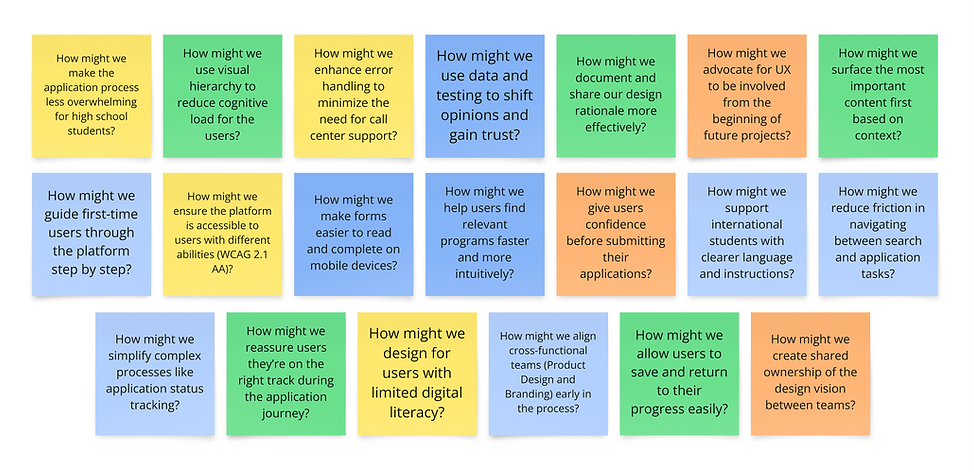
5.3. How Might We (HMW's)
These are some of the HMW questions generated during the ideation workshops and design strategy discussions
Major Roadblocks During Execution
6. Leadership Conflicts in Design
-
There was a debate about whether branding or product design should lead the project.
-
After 15 discussions over 3 months, a project manager decided that:
-
Product design would handle research and UX.
-
Branding would handle UI.
-
-
However, no product team members were involved in this decision-making process.
-
Product design was assigned UX and research only, while branding kept UI.
-
This led to unclear responsibilities and frequent misalignment.
-
I worked through this tension professionally, without publicly criticizing the setup.


7. Transitioning out but building Design System and supporting my team
-
After the research phase, I transitioned the project to another designer to build wireframes using design system components.
-
I continued to support by developing design system components aligned with the project’s needs and making decisions.
-
Introduced Accessibility Through Design System Components
8. Branding’s Misalignment with Digital Design
-
Branding worked on brand guidelines primarily for print, not digital.
-
I converted their colors into a digital palette and facilitated multiple discussions to align branding with digital design principles.
-
The product design team struggled with training branding team members, who resisted UX best practices and did not use most of the design system components.

Branding UI
Branding ultimately took the lead in the UI. While UX research was integrated into the process, many of the product design recommendations in terms of UI were either diluted or overlooked in favour of branding decisions.
Here are few screens branding designed:


Handled Resistance with Diplomacy
-
Shared feedback on branding’s UI designs constructively, focusing on usability and clarity.
-
Faced responses like “this is how we design things here” but kept discussions user-centered.
-
Timeline delays occurred, but I remained focused on building alignment.
My Recommendation
Note: After reviewing the branding team's designs, the product team, including the director, and leadership team felt the project was not heading in the right direction.
Since convincing the branding team proved to be unfeasible, multiple meetings to convince the branding team pushed the timeline indefinitely so the last option was to design and present an alternative screen. After l discussed with my manager, I came up with a plan to present it to the college partners and take their feedback. New version was showcased to them, and through A/B testing, they preferred my design for its improved navigation, UI, and UX. This approach validated the importance of user-centered design and demonstrated the impact of well-executed UI and UX principles. Here is one of the screen on the right which was designed by me in 2-3 days before the meeting was scheduled.
Branding Designed

My Design

A/B Testing Results: Branding vs Product Design
To validate the effectiveness of the user-centered design approach, I created an alternate screen based on usability heuristics, accessibility standards, and real user needs. This screen was tested against the branding team’s version through structured A/B testing with key stakeholders and actual college partners.
Objective
Compare the branding team’s UI with my redesigned version in terms of:
-
Usability
-
Visual appeal
-
Task clarity
-
Accessibility
-
Overall experience
Method
-
Participants: 8–10 college partners and stakeholders
-
Scenario: Simulate a real application task (e.g., navigating program options or applying)
-
Metrics: Preference scoring, usability feedback, open-ended comments
Results Summary

Outcome
Despite organizational struggles, product design’s recommendations ultimately won. The final UI/UX decisions, validated through research and A/B testing, led to significant improvements in user experience and user interface.
All the screens created so far by branding were reviewed in a design audit and forwarded to other product designers for improvements. The new website is scheduled to launch within the next six months.
This case study highlights my ability to advocate for UI, UX, drive research-backed decisions, and navigate organizational challenges to deliver a user-focused outcome.
Key Learnings
Persistence leads to impact – It took 8 months of advocacy, but the right UX approach ultimately prevailed.
Data-driven design wins – A/B testing helped justify UX recommendations when internal teams resisted.
Organizational alignment is critical – The lack of early collaboration created unnecessary delays, highlighting the need for better cross-team communication.
Influence doesn't always require authority -
Persistence, evidence, and empathy can move even rigid structures.
User research must be purposeful -
Misaligned personas can derail a multi-year project if not caught early.